Hmart
Hmart
Rebranding of the number one Asian grocery store chain in the United States.
Rebranding of the number one Asian grocery store chain in the United States.
Team: Joyce Ahn
Duration: 8 months
Category: Brand Design

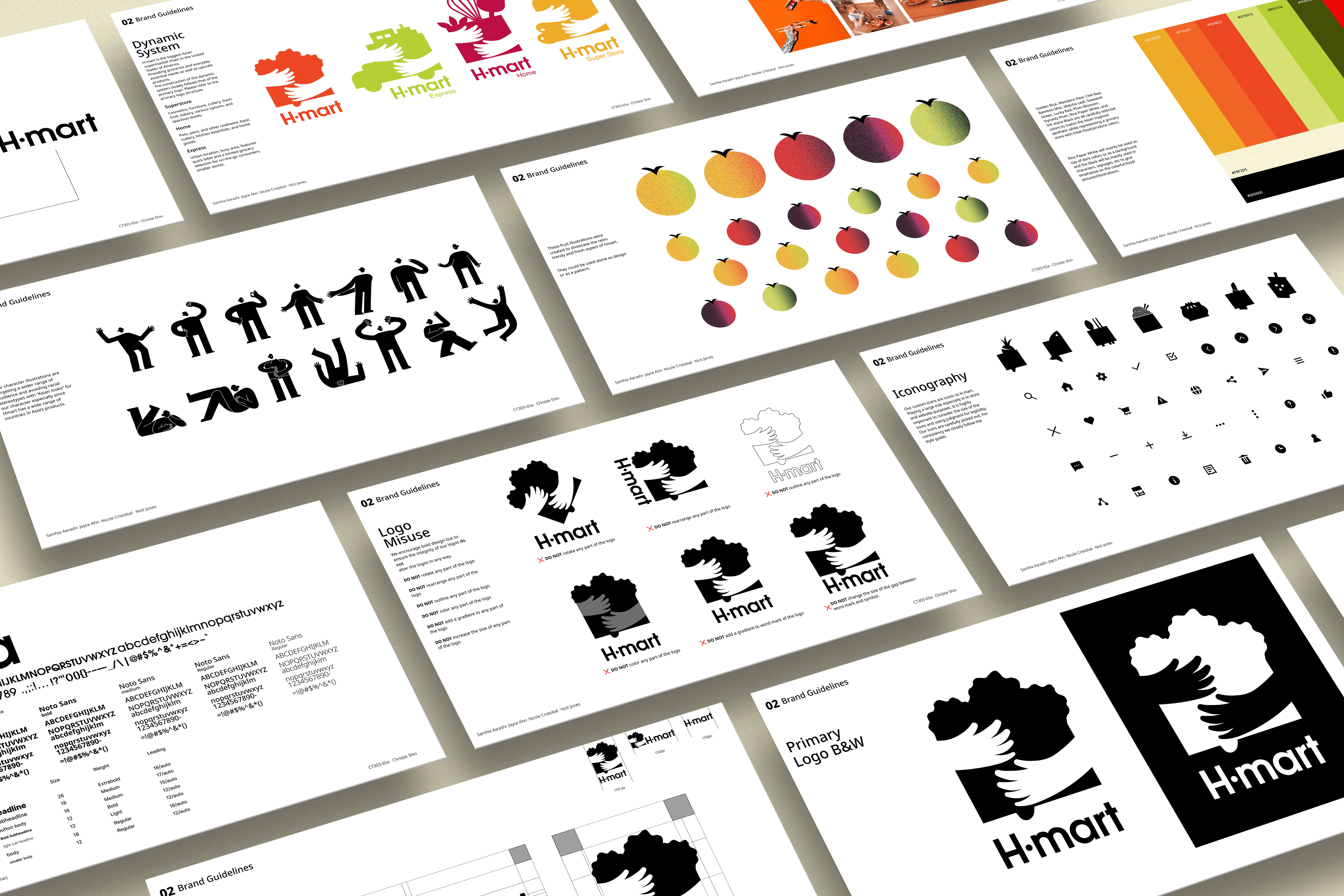
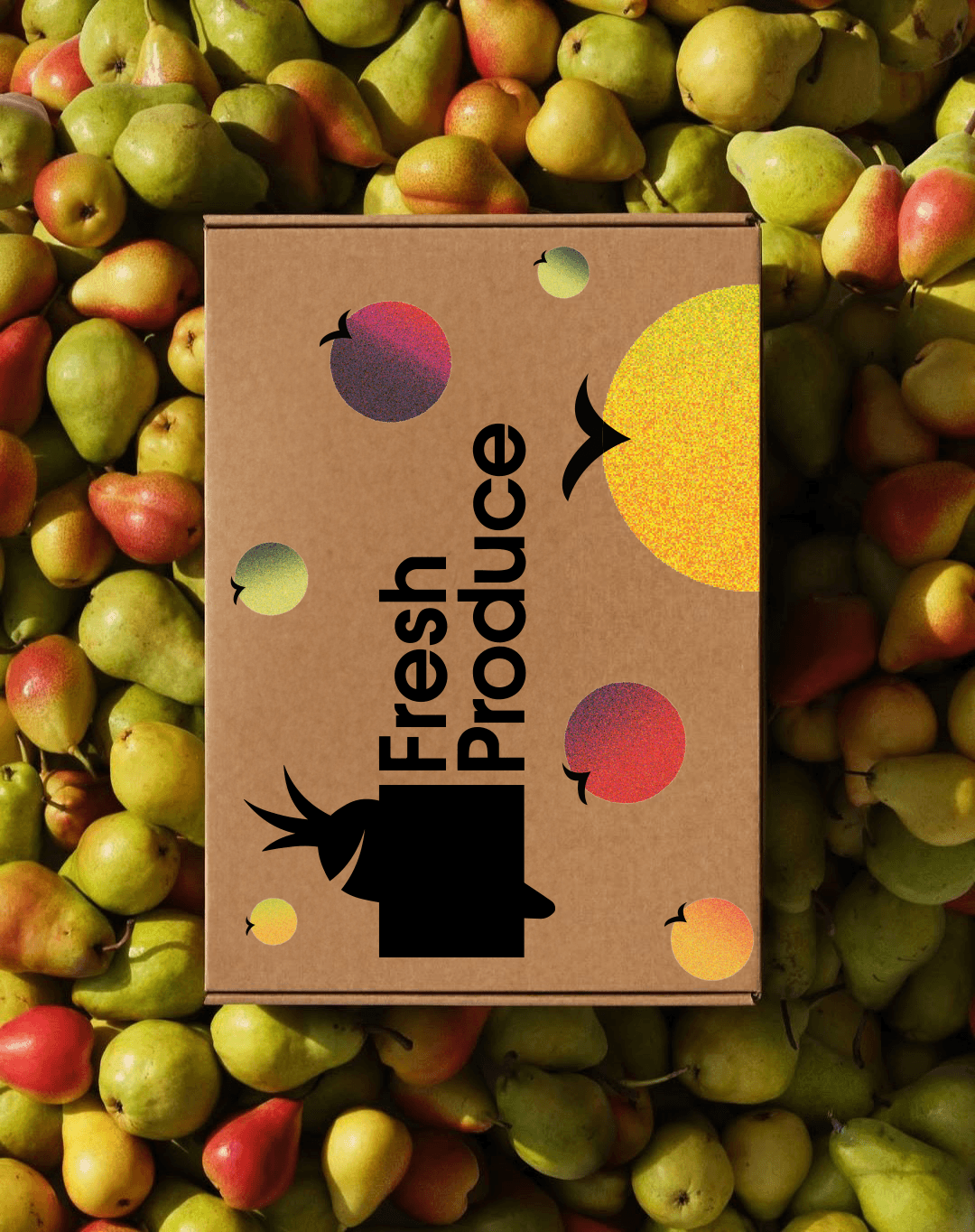
The logo represents H (Hanahreum), meaning “an arm full”, symbolizing abundance and reflecting the grocery’s essence through Asian inspired design.
The logo represents H (Hanahreum), meaning “an arm full”, symbolizing abundance and reflecting the grocery’s essence through Asian inspired design.
The logo represents H (Hanahreum), meaning “an arm full”, symbolizing abundance and reflecting the grocery’s essence through Asian inspired design.

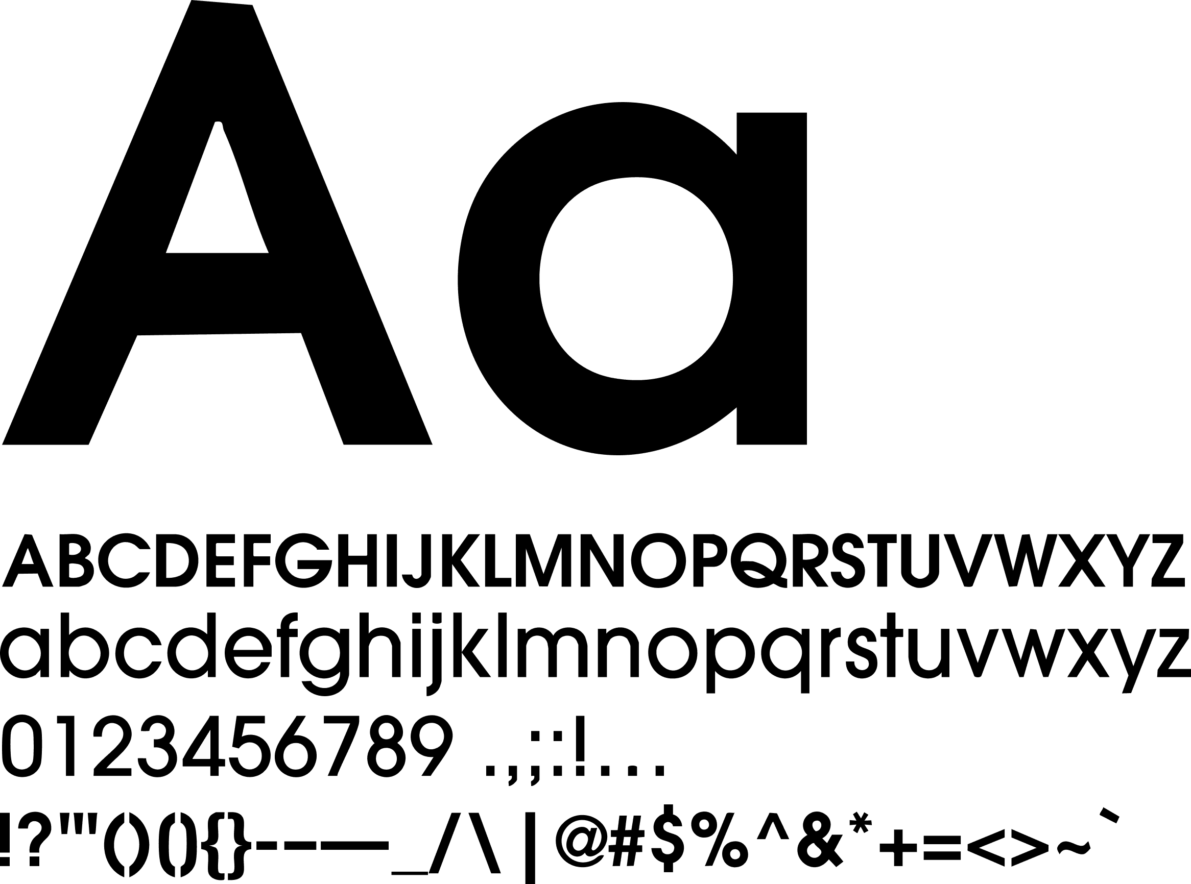
Brand Guideline
Brand Guideline


Subtitle
Contact
jahn0801@gmail.com
214-317-1727
Hmart
Rebranding of the number one Asian grocery store chain in the United States.
Team: Joyce Ahn
Duration: 8 months
Category: Brand Design